1. Collage Drawing Part I (collage)
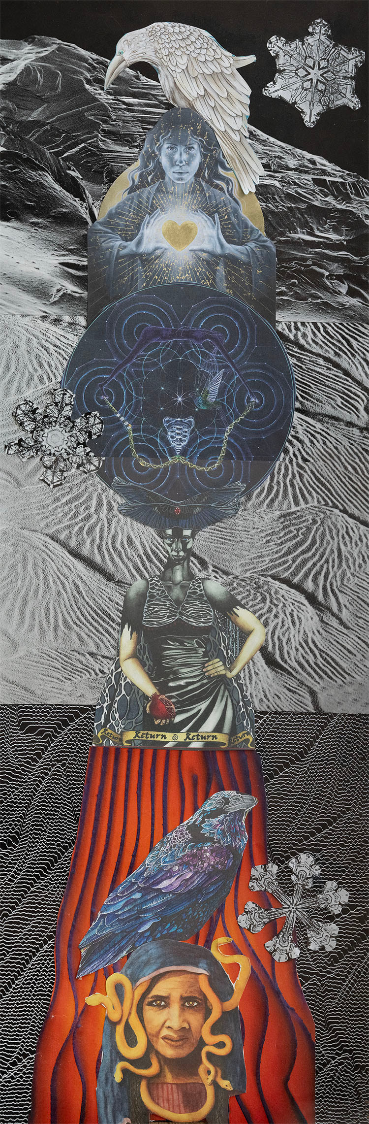
The Trinity Thrones, 7.5" x 22", magazine on paper, 2023
I am very proud of my collage (although the photographing part has been difficult because the piece is so long (22 x 7.5); you will notice half way through there is a glitch with the snowflake, but it's not like that on the physical form...I will work on my photographing of this piece, hard to merge the alignment). I would say my only issue is the craftmanship as the cutting is probably a little shaky and not 100%. I have hand tremors which can is challenging with scissors...the bottom snake lady could be better, but the curvy snake didn't help.
The aesthetics and concept were built together. I had a bunch of all collage scraps from my recent past of collaging for fun and most of these cutouts were taken from a female empowerment book and then I found my microscopic photography book and realized the black and white textured patterns would go well with my three tiered visual of spiritual trinity in female form. It is a powerful expression of myself: 1) the dark bottom layer of the ugly, old snake lady with the dark, mysterious raven guiding her (we all have a little of this in ourself: charming, maybe manipulative or maybe just to draw attention and have piece watch/listen; the dark underworld of soul); 2) the intense middle aged strong woman with raven headpiece and a sacred geometry globe of universe on top: she is the queen of now ready to take on the patriarchal society we live in with her fabulous cape and matching attire and a hummingbird to guide her including a pomegranate heart in her hands representing fierceness and at the same time gentleness; and 3) the young, vibrant, heart of gold lady shining her love from above with a white raven to guide her taking place in the heavens above where the sky (despite black) is showing and is watching from above always showering with the heart of emotion. The snowflakes all represent a unique piece of water element that is symbolized in the authentic personality/soul trait of each woman that is fluid and situational and a learning piece of each stage of life because water holds all memory.
I love all the textured elements of the background. It feels flowy, hard, transitional, temporary yet solid and confident. I like the idea of spirit animals to bring the idea of nature as companion. The whole piece is grounding and ethereal with a cyclical foundation.
This collage communicates ME or any female journey (perhaps a little like the Hero's Journey). Rather than a circle, it's up and down to symbolize a hierarchy that can be ascended/descended at all times while staying current in the present realm of now self. Like a Kundalini rising and falling, from heaven to hell, from young to old, past to present....we can be all at once too.
2. Collage Drawing Part II (drawing)
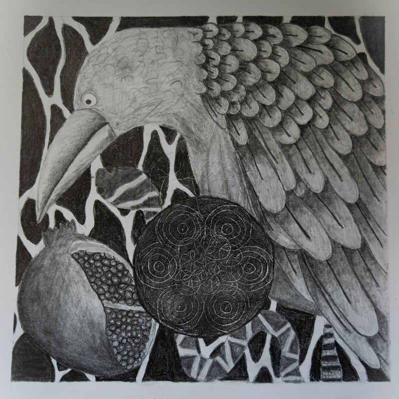
Internal Guides, 12" x 12", graphite on paper, 2023
I believe my drawing looks done. You will notice the tracing outline in the center of the drawing that is camoflouging into the piece - it's of a lady from the original collage. That was not intended, more of a mistake of tracing for my first time and running out of the special canvas paper. I sort of like it and I am sort of bothered by the mistake. It is a bit more pronounced on the photo than it actually is physically. However, I appreciate the message it conjures, which is the deep inner vision that brings these elements altogether = aspiration to a higher self and consciousness.
Another mistake is the flower of life circles. I got all messed up while drawing and tracing them from that little picture I traced.
I wanted the sacred geometry center and a large raven, those are the two subjects I started with. The pomegranate heart seemed the next appropriate to add in representing my own heart and sweetness inside. The last two elements of the snake and background fell into place as I wanted texture and more really dark shades in the piece. The snake symbolizes many aspects of an individual but also on a human, evolutionary and religious perspective. As it guarded the garden of eden tree, it guards the ultimate unity of nature/self/mind (sacred geometry) with the heart and playfulness/intelligence of the raven.
At first, it was super challenging to figure out what elements I wanted to compile in this collage drawing - and I spent the first few days a mess and thinking I was a failure because I just couldn't follow through with a regular tracing copy.
I love my use of varying textures and contrasts. The feathers turned out great with the shading and I am proud of the beak. Pomegranate was overwhelming at first and then transformed into a realistic object. I make use of all shade values.
My shading is successful as well as placing elements for a solid all-around composition. There is enough white and dark and all the greys in between. The tracing was not as successful as I would have liked it to be, but it did its job. Taking these subjects/elements and magnifying them is something I am proud of. It came together very nicely.
I compiled all my elements into what imagery/symbols represented my original message the best. I know my drawing skill level and rejected many parts of the collage because I knew I could not implement them (as your guidance as well). For instance, the three ladies and the incredibly texture backgrounds. The hummingbird is an essential part I did not include due to the idea of two birds in the drawing, which is why I used the heart instead. Taking elements of each tier of self from the collage and condensing it into a few images for the drawing.
Inner guidance for myself and any person in this human journey. All animals aspects represent parts of our self. And the ultimate key part is the unifying element of nature and consciousness with the flower of life.
3. Cardboard Sculpture
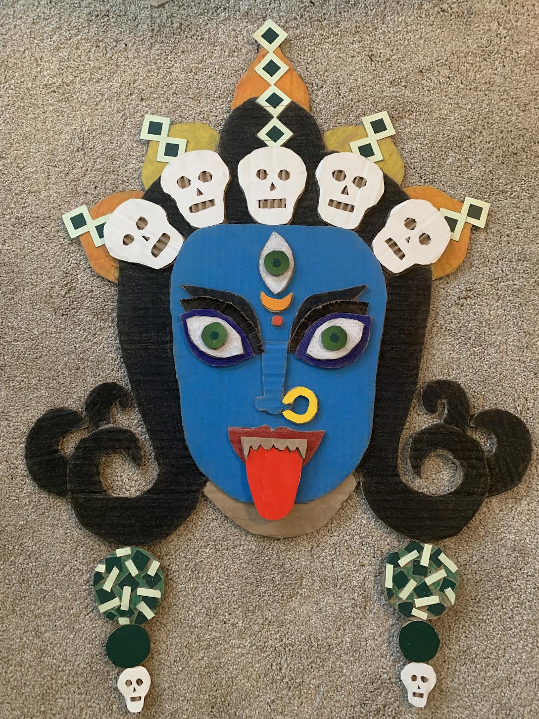
Kali - Dance with Time, 21" x 28", Prismacolor pencil on cardboard, 2023
My Kali mask turned out better than I had visualized especially with adding the color. I contemplated quite a bit with whether to add colors, with just a little bit or everything. I slowly added texture with the eyelashes and wanted to make a few elements stand out like her eyes and nosering, and then it all just coming together with other colored cardboard. I took the big risk when I colored her face blue and fell in love with it. I cannot imagine anything from India being colorless especially a well known goddess like Kali.
She is fierce and sexy (so says my friend) and I would agree. I feel like I put a lot of myself, built up emotions, into her making.
It works as a non seeing mask, where you cannot actually wear it, but would need a stick to hold up.
The concept for this class is probably significant due to the many layers of what she means to me in my life. As an artist though, the concept is nothing new. It takes on tradition, on the idea of what a mask represents, and the energies it can channel into the holder/wearer.
The eyelashes and eyes are key to the mask, drawing you into her gaze, her rapture.
Craftmanship is decent. I was a little sloppy with some cutting at first (I would love my own art table to work on, I have a small apartment with kids toys everywhere) and sloppy with the glueing (before I realized I wanted color)...could be my AHDH and impatience with the process. It is not 100% symmetrical either, the eyes are not exactly aligned nor is the top crown line of jewels (which I like sometimes because I like that art does not have to be perfect). One area with too much glue is an earring, so I couldn't color it fully green. I am looking for similar green pieces to layer more on top to camouflage better.
Other than that, I think the layering and textured affect is spectacular. The colors choices are ideal. The tongue cardboard is actually from a McDonalds's fry box, which I love. The nose ring is from a cheerios box, and the crown/earrings are from a fancy salt box.
I have left a little bit of uncolored cardboard in the chin area as I have yet to decide if I want to add some necklaces. All these Indian Goddess images are adorned with jewels, but it adds some more elemental work, which I don't know if she needs.
This is a prime example of flow. I took an image and transformed it into something real, tangible with was not planned but purely executed in the moment.
I can see myself doing a lot more of these cardboard pieces especially since they are free and unlimited in access. And masks mean a lot to me since I am now an unmasked Autist. I spent my whole life living as someone I was not. Plus, I used to collect masks from all my travels and yearned for that connection of masks to my own self journey.
So with Kali, her dance is of time, which brings destruction to start something new. I often feel like this type of catalyst when entering new situations or circumstances. I embrace change and look forward to a new chapter in my own life as someone who finally understands the benefits (and curses) as the "other" and blending in or standing out.
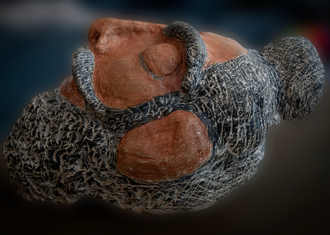
4. The Andy Goldsworthy Project
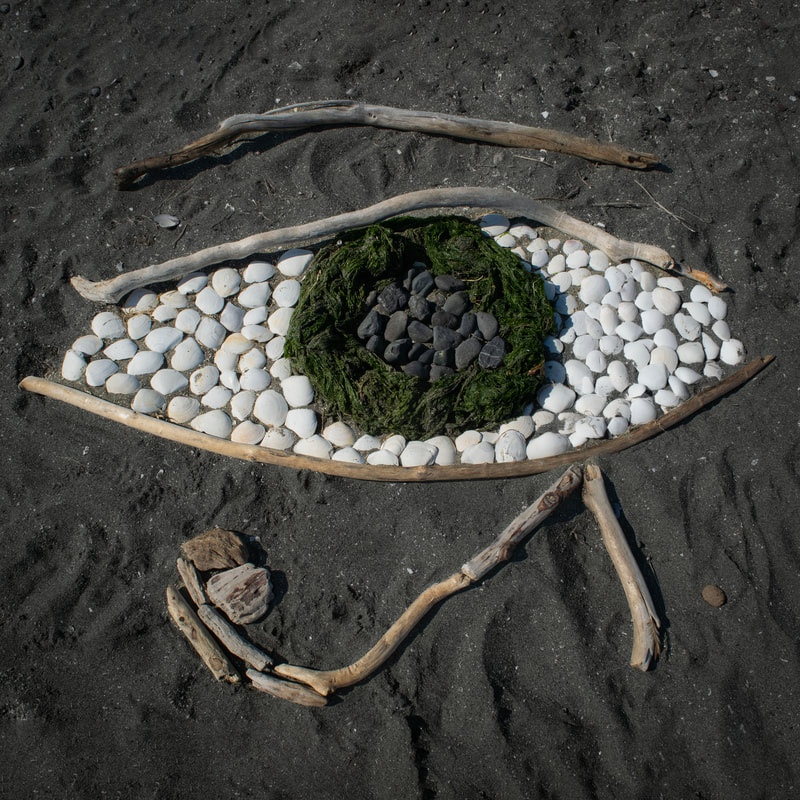
Eye of Horus
|
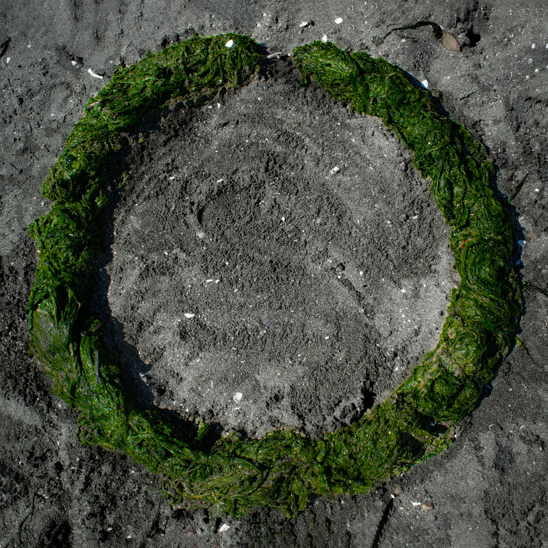
Ouroboros
|
I have two submissions that go together in terms of symbolic theming: 1) Eye of Horus and 2) the Oroboros. Both symbols originate from ancient Egypt, which is themed around the sand element (desert and Pyramids), but brings in the beach surroundings with it's elemental foundation.
On a personal note, I love the idea of alchemy, mythology, and transformation, which is obviously represented with the infinity symbol of the snake biting its tail (although it looks more like an eel, which was my intent for the beach composition); and the eye demonstrating healing and protection with the green eelgrass iris standing out and the intensity of the white bringing emphasis of softness and purity.
You cannot miss these on the beach as they're certainly eye-catchers (pun intended). I have used shells, driftwood, eelgrass and stones all from the beach.
I think this idea of making these symbols on the beach is pretty original (although simple and easy to do), but I doubt the intention is missing if made on the beach like mine. Eyes and circles are easy to design/create. I would say even a child could do such a thing (as my daughter helped me gather and form), so the craftmanship is nothing extraordinary. However, finding the right pieces for the eye was a little more technical.
The lighting is simple and I darkened/contrasted in the editing process as it may have been a little over exposed due to sunshine overhead.
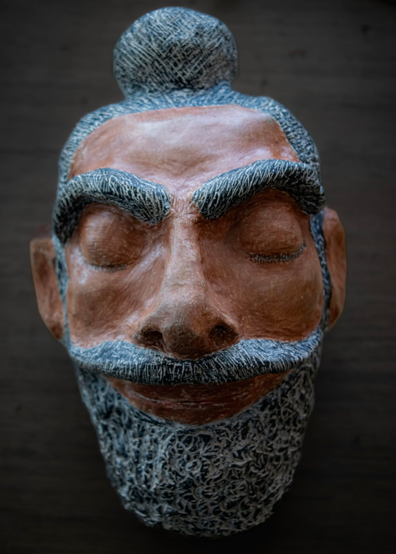
5. Ceramic Portrait
|
|
Amitoj, 4.5 x 8 x 4.5, Colored Pencil on Self Drying Clay, 2023
This is a portrait of my belated husband, Amitoj. I wanted to commemorate him as I began this sculpture on his 2 year death anniversary.
I am very proud of this sculpture despite the proportions being slightly off with the eye width (his eyes were not so far apart); I think I used a bad quality photo as it was the only one I could find physically on hand. I was mostly trying to go off memory since he was the person I saw the most of for 5 years straight and now I don’t see him at all.
There is texture where I want texture and the most creative aspect: beard, mustache, eyebrows. These are his most prominent features along his bun on top; he was a Sikh Punjabi Indian. I was always so proud of his heritage and his knowledge of his people’s history.
I ran out of clay so his beard is not as big as I wanted it and his lips are flatter than I want them to be. My clay also hardened extremely quick! I think it’s because I use a dehumidifier all day???
I kept his eyes closed, so he may Rest In Peace. I think I would freak my daughter out if they were open.
The sculpture came out Greek/Roman-like with the beard and lack of eyes. He also has a buddha-like influence with the peacefulness of his face and his bun on top.
I was originally going to paint his skin gold-like with super black hair but decided to go with the pencils (which took a very a long time).
I am glad I brought color, I was originally going to keep it the typical “statue-like” because I felt it’s what he would have wanted in honor of himself. He hated his very black and brown skin (and I think the colored pencil is a little too brown for his real tone, but this is what came out). The color definitely adds a realistic aspect to it. And I am glad I didn’t use paint because the hair texture really comes forth with the pencils (and that’s what I wanted although I wish I could get a little darker in the beard…he wasn’t graying, it’s just the grooves I made previously to drying).
Color is smooth where it needs to be on his skin and textured where it needs to be on his hair. Color represents his real self. The slight smile and closed eyes represents his higher self now.
Amitoj, his name, means nectar of enlightenment. He died at 30 years of age. He was my best teacher and a loving father to our daughter. She has been holding the sculpture, hugging it, and kissing it. Very sweet.
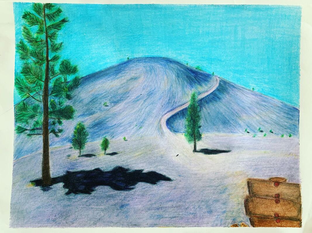
6. Prismacolor Painting
|
|
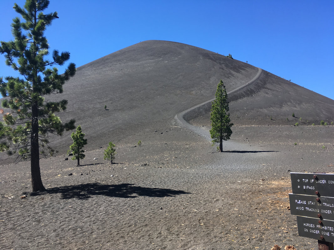
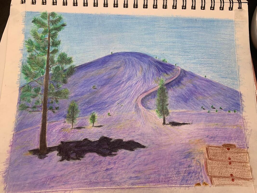
Lassen, 10.5" x 8.5", Prismacolor pencil on paper, 2023
After looking at this piece for so many hours, I don't find it interesting anymore, haha. I am bored with it. I am bored with the one tone sky, I am bored with the constant layers of colored penciling. I am bored with my inability to bring other colors into it.
However, when I chose the photograph (which took a long time to decide due to my dislike of colored pencils), I for some reason concluded with its otherworldliness. The trees are spaced in an interesting formation and the path is a hero's journey, which I failed as a pregnant woman at the time. It was so quiet there! I crave quiet in my life. I The tree shadows are prominent. I like the placing of the little trees that stand out well amongst the strong purple blue contrast.
The sky is lacking depth but that's how the photograph is: California Blue sky. I do like how I brought in yellow and orange for the lighter colored sand element as well as the purplish-blue (despite it's changing from the original of greyish sands). Trees are layered well with many green tones and light/dark shadowing. I could get a little texture in there to showcase the pine needles (difficult with the little trees). The one element that is missing is the numerous sand grooves/shadows, which made me very frustrated. For this reason, the grounded sand lacks a little bit of depth and makes it quite a dreamy/flowey landscape instead of the more harsher desert like sensation. But I think Lassen is like that: a unique little high altitude weird desert pine landscape.
My prismacolor version is well representative of the original despite the coloring difference in the sands. For my first shot, it's not too bad. I could have practiced more with the shading but that would have taken more time than I had (I am getting off medication right now so my issues are chaotic).
I do think it is compelling from afar, maybe not so much up close. The sign is a little out of place; I didn't want to use lettering on it for some reason. I turned it brown because I didn't want any more black/grey tones in there, I suppose I wanted more to use some other colors. The layering of the sands and colors on the mountain top is well done, in my perception. Seeing the lines marks and shading is appropriate.
NEXT SECTION - MULTIMEDIA PROJECTS
